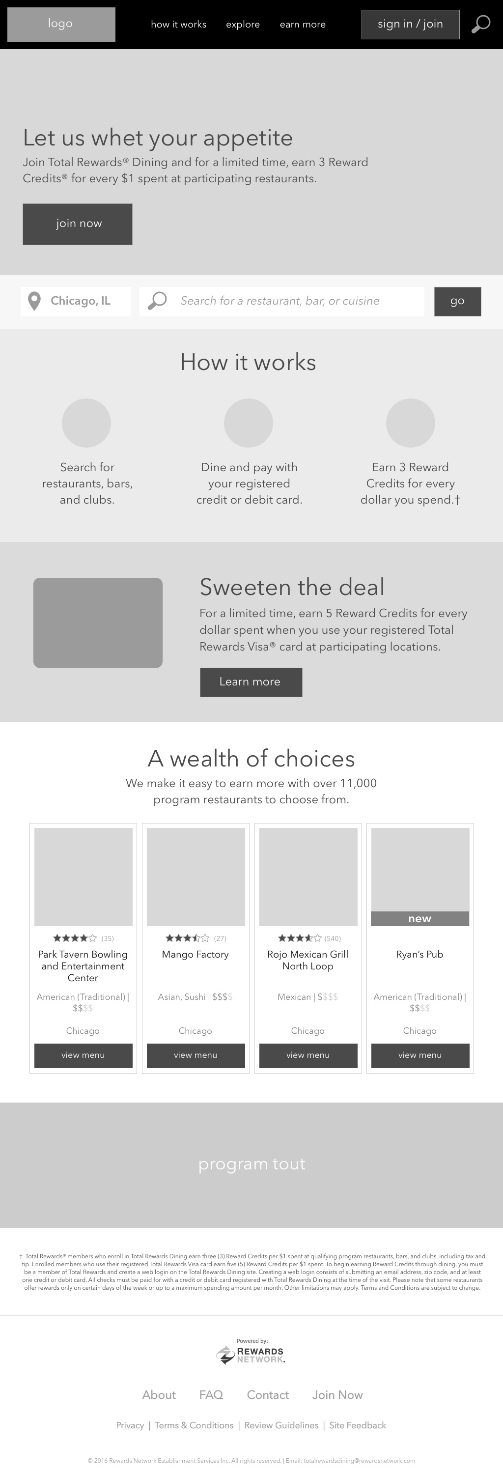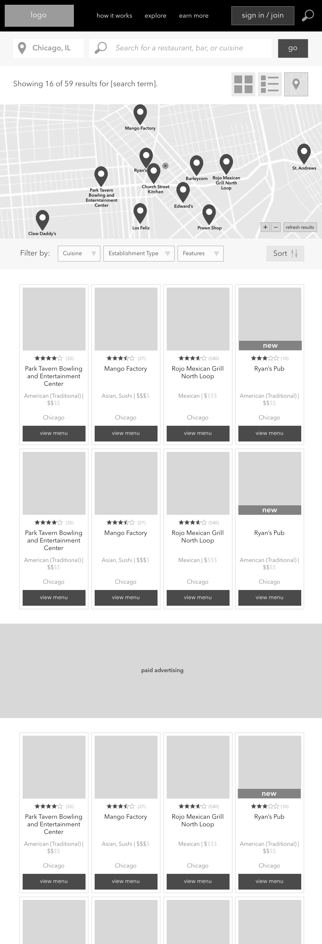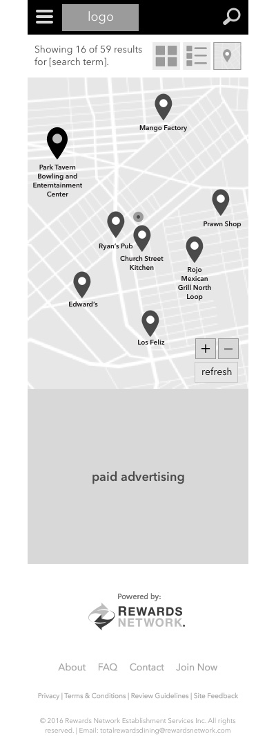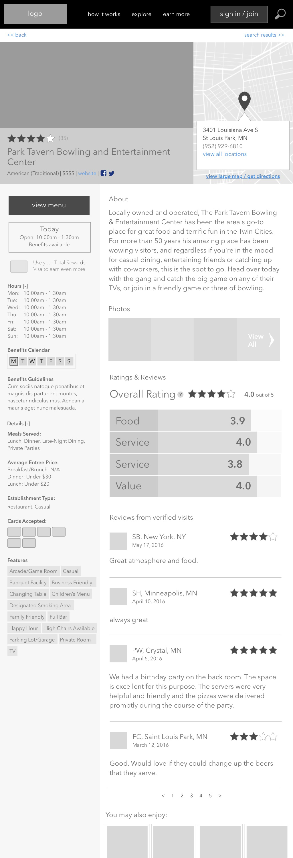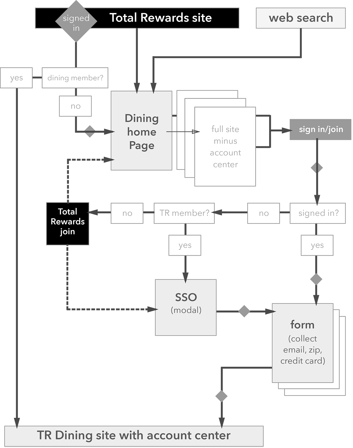
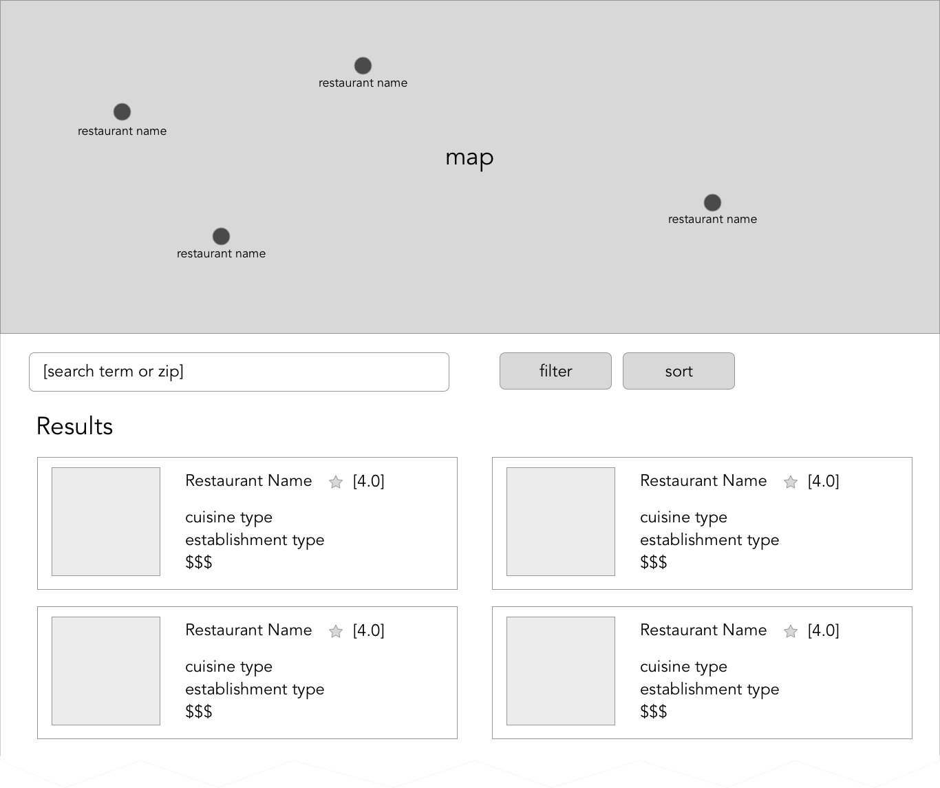


For this project, I used predefined personas that Rewards Network had created. I started with a list of required information and determined a basic flow and what pages were needed. Using competitive analysis and data from existing Rewards Network sites, I determined page layouts and workflows that would take advantage of the user’s existing mental models. The first designs were basic layouts in Sketch to get feedback from the rest of the design team and development.
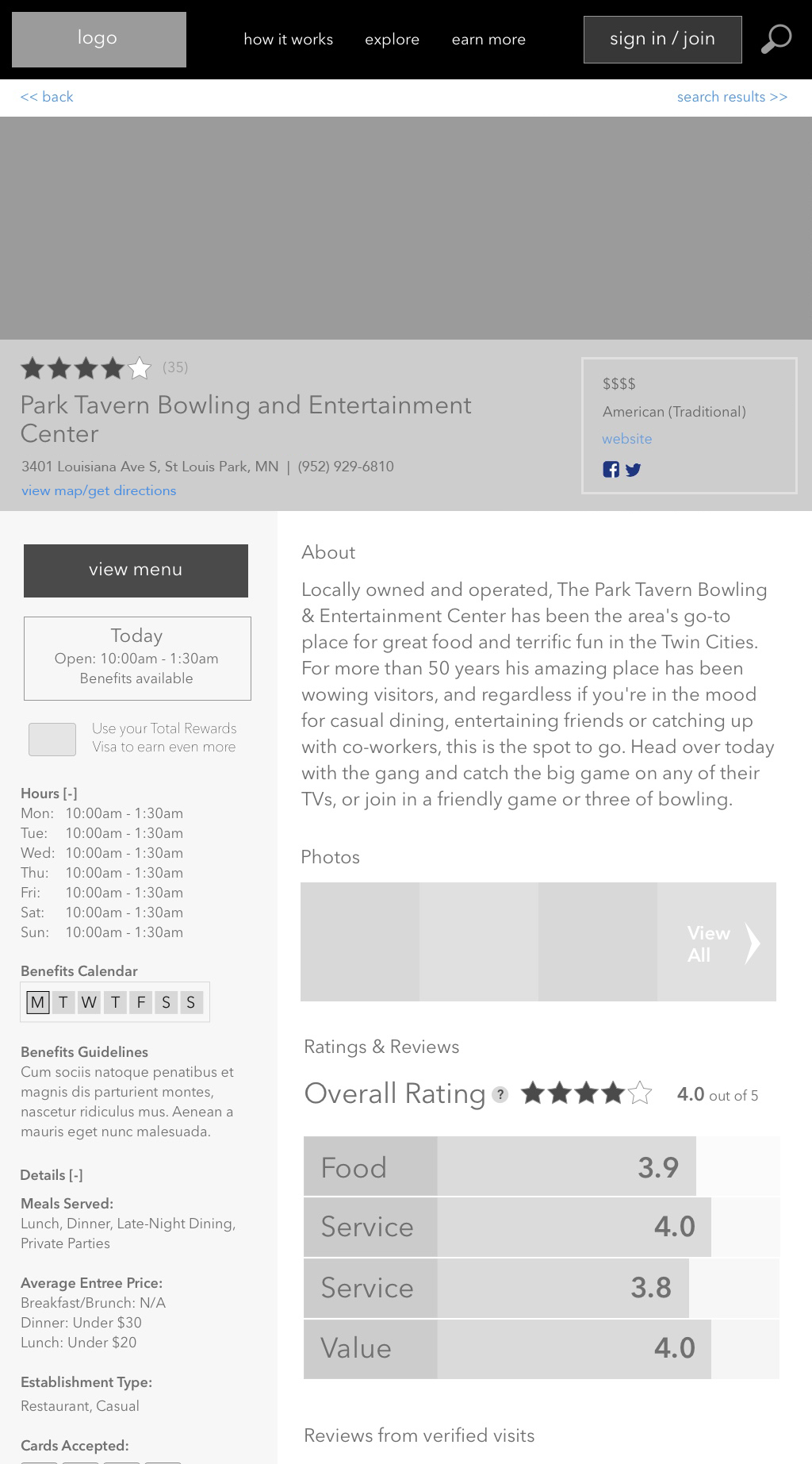
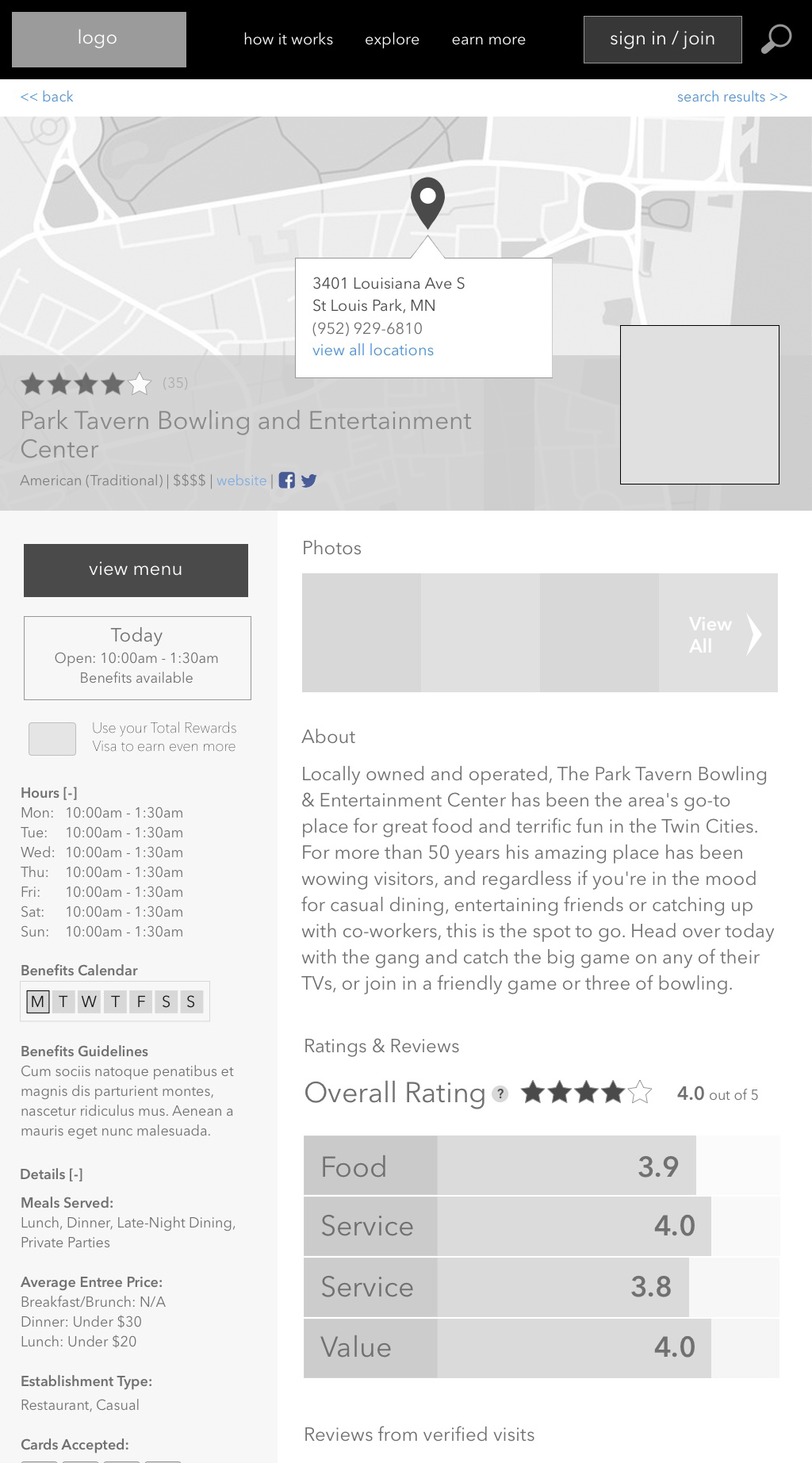
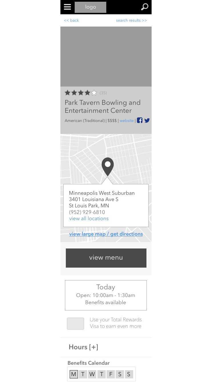
I experimented with different layout options for each page, for both desktop and mobile versions. These were shared with the team during weekly meetings to determine which ones captured the most important information and displayed it to the user in an intuitive way. Feedback was incorporated into further iterations.
