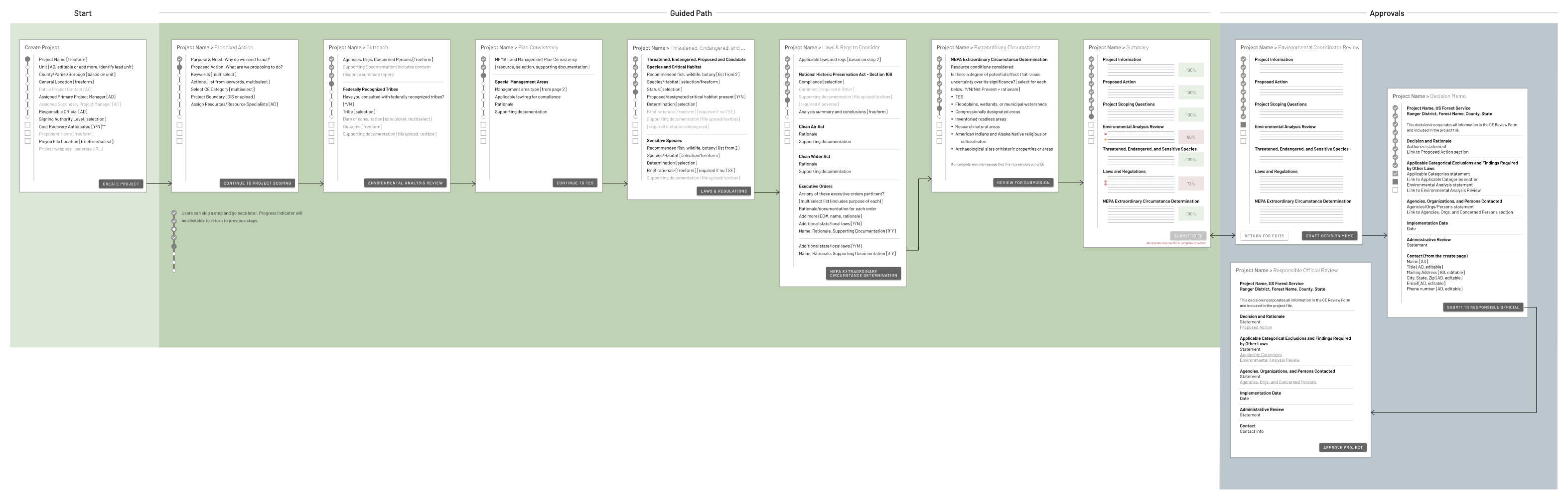
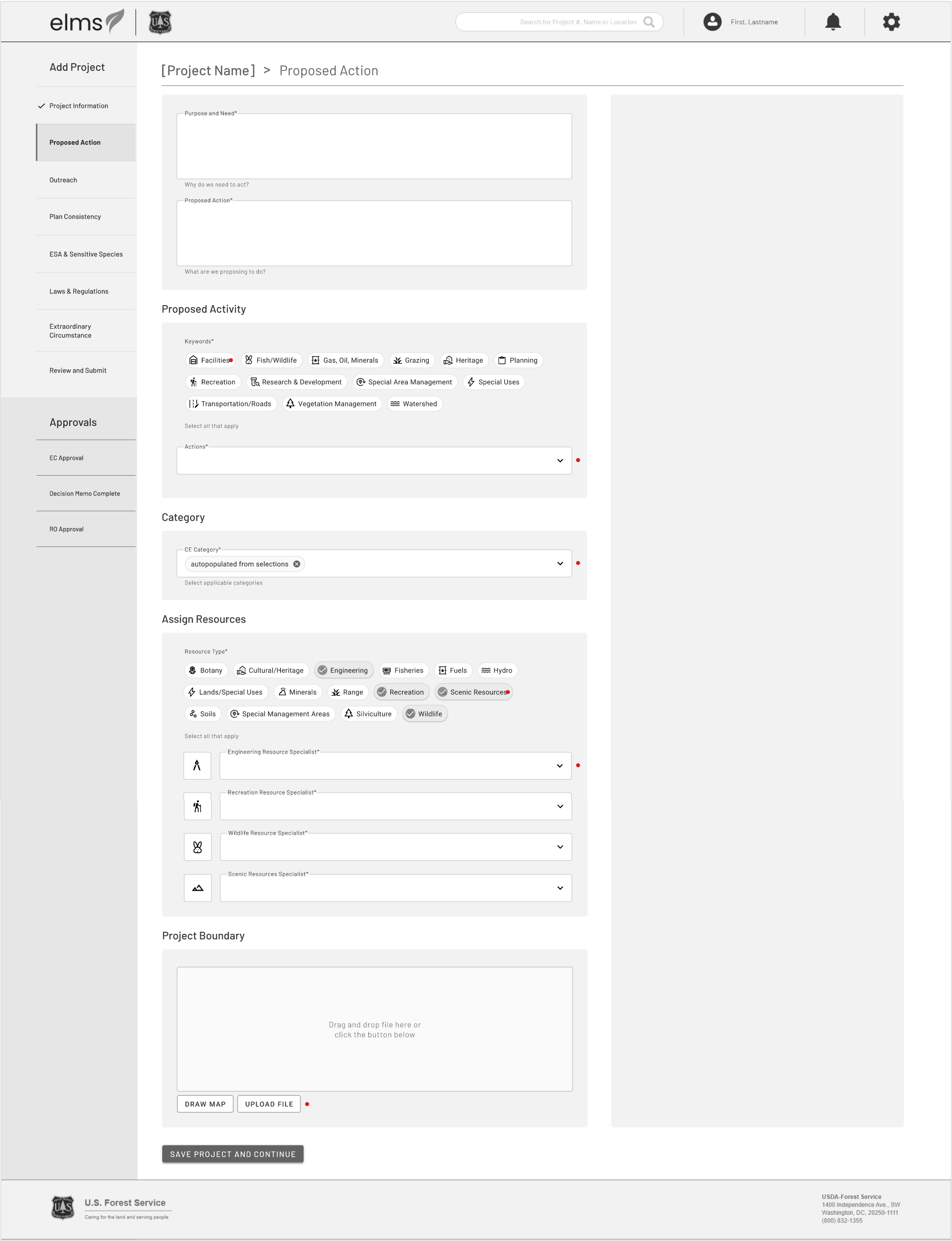
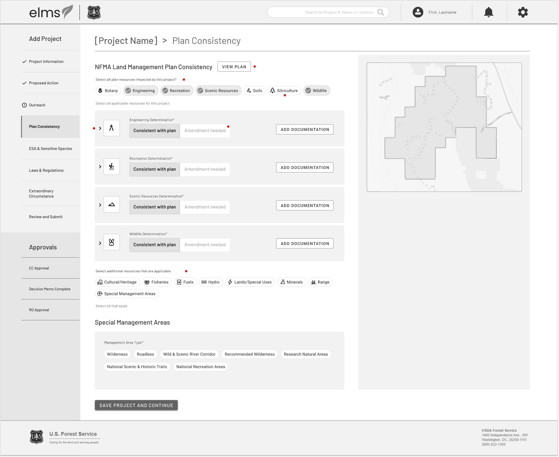
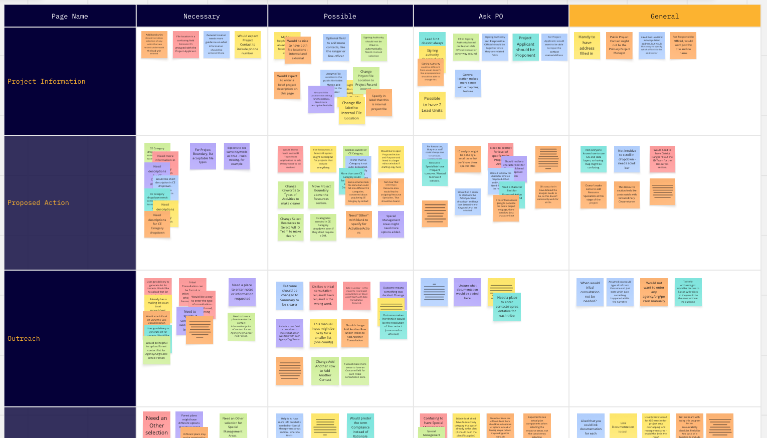
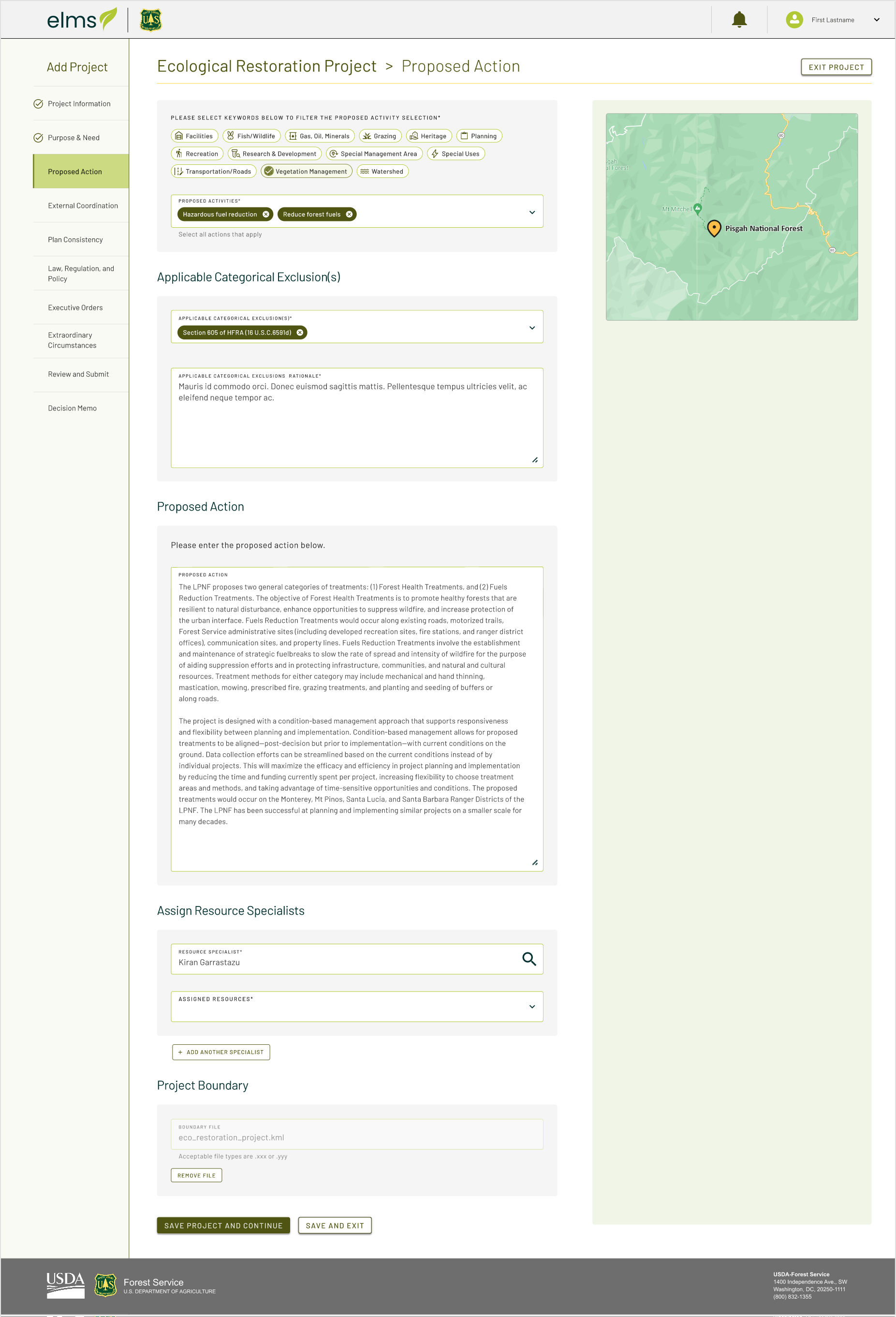
End to End Design

Building a new application for the Forest Service

The Problem

The US Forest Service was managing their projects using three separate antiquated tools, having to create the same project in each to manage different aspects of it, like budgeting and approvals. They wanted a more efficient way to locate project information, manage new and existing projects, and view all approvals and comments in one place for every project. In short, they wanted a new application to combine the functionality of multiple existing applications into one unified flow for project management.

Preliminary Design Strategy

I joined the project a few months after it started, so discovery work had mostly been completed by another designer. I started by reviewing interview transcripts and the project requirements documentation to determine what information we had and to begin to scope out the design requirements for this new application.

Based on the requirements and preliminary discussions, I created a flow showing where various stages of the project management process could be added or edited within the application to get buy-in from the project owner and subject matter experts(SME). Because this application was for internal use by employees who were already very familiar with the tasks they needed to do, there was no need to break down the project entry using a one question per page approach. This was a complex application with multiple steps and collaboration by different people. We needed to design it so the steps made sense and asked all relevant questions together so the flow was cohesive and intuitive.

 
A basic workflow for an application with information sorted by page

Design

Once the basic flow was approved and we had agreed on an approach to design one section of the application at a time to hand off to engineering, we began working on some low-fidelity wireframes to lay out the pages. These low-fi pages were shared as a prototype with multiple SMEs as well as the product owner.

There was a lot of feedback, mostly around organizing the pages into steps that made sense for the various roles accessing the application. For example, we originally combined the Purpose and Need statement with the Proposed Action statement since they were directly related to one another, but through this initial sharing, we found there were people who would need to read and edit the purpose and need statement, but not the rest of the project, so it made sense to move that question into its own step, making it easier to find and comment on or edit.

Low fidelity version of an application page showing a form Low fidelity version of an application page with additional form fields

Preliminary Usability Testing

We incorporated the feedback we had received and created a testing prototype. We tested this in one-on-one interviews with multiple project managers and specialists who would need to use the application. Our preliminary flow was validated, but we did receive feedback on several of the steps about how we might improve this further based on the questions we asked and the information we were requiring. For example, most users said they would upload a spreadsheet for endgangered or sensitive species, so asking them to input this information separately was tedious. We synthesized and reported out our findings, then discussed recommendations with the product owner.

Miro board showing synthesized findings from usability testing

Finalized Designs

Throughout this project, we were hampered by the fact that the product owner changed multiple times, and the new product owner inevitably had their own opinions about priorities and MVP. However, after the initial round of usability testing and armed with those results and recommendations, we were able to finalize designs that incorporated feedback from both the usability testing and the current product owner, which were then handed off to engineering. We also created basic components as a simple design system so the engineers could reuse elements on multiple pages.

High fidelity version of an application page showing a form with various selectors Design components and styles

Usability Testing in Staging

Once the pages were built and in a staging environment, we were able to test one more time with a new group of specialists and project planners. There were some bugs found that needed to be fixed, but testing was positive overall. Any design issues raised were written up and planned as future improvements.

Miro board showing synthesized findings from usability testing

Results

We released the beta version of the application to overwhelmingly positive response and continued iterating to incorporate more advanced features.

Challenges

  • We had four different product owners over the course of the project (up to the beta release)
  • Engineering work done concurrently with design work, resulting in duplicative work and some compromises to the design
  • We created a new design system instead of using the US Web Design System (USWDS)for this application
back to list