The Problem
45% of clients visited the dashboard builder but only 5% actually built a dashboard.
Why? Because what they saw was a blank page. They didn’t know what to do next and there was no context to help them. Their most common response was to call their product advisor to ask for a custom dashboard, but that took time and resources away from other clients. Our data showed clients were willing to create dashboards themselves. They just didn’t know how.
Discovery
Competitive analysis & stakeholder workshops.
I created a matrix of features found in popular dashboard builders and compared that to our existing tool, noting where we fell short or where we might have a competitive advantage. I also did a heuristic audit of the existing tool to identify other opportunities for improvement.
I then met with engineering and stakeholders as a group to discuss pain points, client-requested features, advisor-requested features, and overall usability, and discussed these in terms of the personas I had created for the suite of applications.
-
Competitive analysis

-
Heuristic analysis

Initial Design
Wireframes using templates and/or a wizard to make the process easier.
From my competitive analysis and experience with other dashboard builders, I knew that templates were very common and sometimes required, and that having that template to drag and drop into would help users begin a new dashboard.
The product owners and SMEs wanted a wizard that would walk users through the process step-by-step to remove any cognitive overload.
-
Dashboard template

-
Wizard

Challenges
Limiting factors led to a change in goals.
Redesign
Moving away from a wizard and back into a more complex UI.
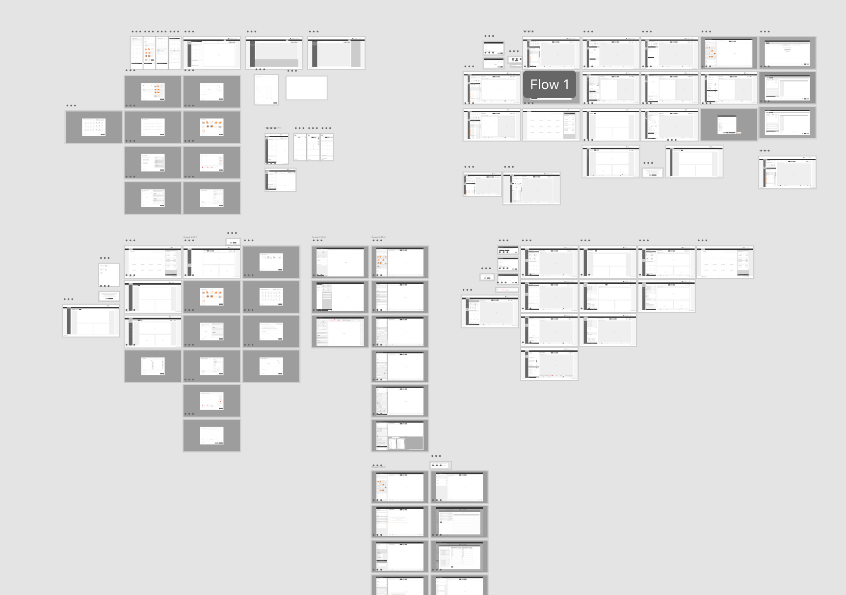
Several rounds of wireframes were produced and reviewed by the whole team for input. There was additional discussions with engineering around features and what was feasible, and additional edits were made. This included removing the templating feature since there wasn't enough time to build it out.
Because the long-term goal was still to encourage clients to try the tool for themselves, the MVP design focused on making each page more intuitive and included a stepped navigation to make the steps clearer.
-
Iterations
-
Dashboard Builder

-
Component Overlay

Results
Over 50% reduction in time to create a dashboard. 20% increase in customer user.
The dashboard builder redesign was initially launched with one product (5Maps) for client and advisor testing. Initial client feedback at the conference and to advisors was positive, and client use increased, especially after additional training. Further iterations focused on making the product more aligned with competitors were planned.